Customize a mark
The rendering of all marks can be customized if the default doesn't conform to your need. Charts.kt provides different ways of customizing the rendering depending on the level of customization you want.
In this guide you'll see how to:
- Style your signs (data points) depending on their values
- Go further by creating a custom mark decorator
- Use your decorator in your charts
- Complete or replace the default decorator
Find a similar Javascript example code here: https://play.data2viz.io/sketches/wYwzBL/edit/
Example of a mark decorator
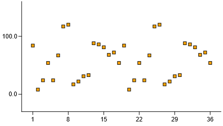
You have a chart and want to highlight values that have a specific "status". You also want to use a custom "selector" in the form of a small red triangle, and add a custom label when a value is critical.

Let's see what you need to do to create this.
Mark styles
Most standard marks have default styles that can be overriden.
Simple property
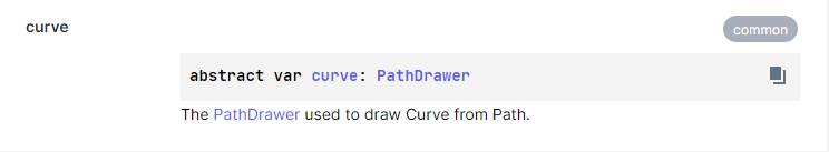
When you look at Charts-kt reference, you can see that some styles are straightforward, for example, the curve value of a LineMark is a simple property that defines how to draw the line: straight, curved...
If you set the curve property to Curved, your whole line will be drawn with curved lines:
"Dimension property"
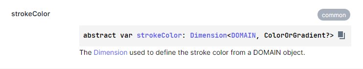
Some other styles are not constant, they are computed when drawing, based on a given Dimension, like the style strokeColor for the LineMark which is the property used to get the color of the line.
With this type of property, you can define some values that return a ColorOrGradient? value for a given DOMAIN object.
Let's see an example of what you can do.
You have domain objects you want to plot on screen, and these objects have a status property:
chart(data) {

    val id = discrete({ domain.id })
    val value = quantitative({ domain.value })

    plot(id, value) {

        strokeColor = discrete( {
						when (domain.status) {
							Status.OK      -> Colors.Web.mediumseagreen
							Status.Normal  -> Colors.Web.black
							Status.Warning -> Colors.Web.orangered
							Status.Error   -> Colors.Web.red
						}
		    } )
		}
}
Your strokeColor is now a discrete Dimension, this dimension takes the status property of your domain object, and returns a Color for each of its values.
When the PlotMark draw function is called, it will compute the strokeColor for each point:
Custom decorators
If you want to go further and replace the default style of your mark, you have to create a custom decorator.
It is very easy in Chart-kt using aDatumDecorator.
A DatumDecorator is a lambda that takes 3 parameters:
datum: Datumthe datum created from your business objectposition: Pointthe expected position of your sign (may depend on the Mark type)drawingZone: DrawingZonethe screen zone where you're expected to draw, all coordinates are relative to this zone
You can of course refer to other properties from your chart, but these 3 parameters already allow most customizations.
Let's have a look at a very simple decorator:
myMarkDecorator = { datum, position, drawingZone ->
    drawingZone.rect {
        x = position.x - 3.0
        y = position.y - 3.0
        width = 6.0
        height = 6.0
        stroke = strokeColor(datum)
        fill = Colors.Web.orange
    }
}
Of course, this example is for your understanding only, because if you had wished to do that, simply changing the symbol and the strokeColor properties of your PlotMark would have done the trick.
Custom decorators are interesting as they can rely on several properties. For example, you may wish to display icons, but only if enough space is available. In a case like this, you can bind the decoration to the
Chart.zoom.xZoom.ratiovalue or yourScene.widthfor example.
Plug-in custom decorators
When you have created custom decorators, you want to use them in your charts.
Standard Charts-kt marks have implements several interfaces when they can use custom decorators:
HasMarkDecoratorthis mark can use a custom decorator for every signHasHighlightDecoratorthis mark can use a custom decorator for highlighted signHasSelectionDecoratorthis mark can use a custom decorator for a selected sign
If your Mark implements one or all of these interfaces, you can plug your custom decorator on it. Let's look at the standard one, HasMarkDecorator which contains:
val defaultMarkDecorator: DatumDecorator<DOMAIN>var markDecorator: DatumDecorator<DOMAIN>
The defaultMarkDecorator is, as its name implies, the decorator used by default.
You may want to use it when creating a custom decorator. In this case, don't forget to call it in your lambda.
The markDecorator property is the way to "plug" your custom decorator.
Example implementation
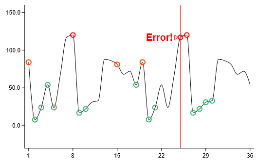
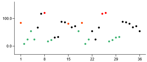
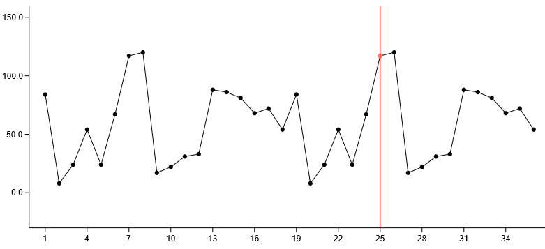
Now let's get back to your chart, you want to go from this:
To this:
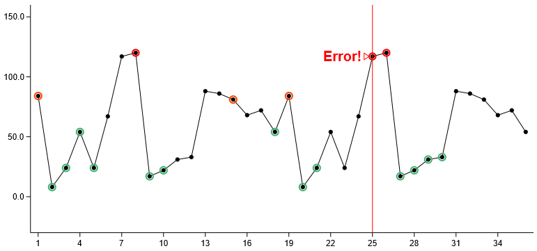
So you need to create:
- a "status" decorator for the marks that draws the colored circles over them
- a "selection" decorator that display a little red triangle and a message based on the status property of our data point
chart(data) {

    val id = discrete({ domain.id })
    val value = quantitative({ domain.value })

    // my values
    line(id, value) {

        strokeColor = constant(Colors.Web.black)
				curve = Markcurves.Straight

				// the "mark status" decorator
        markDecorator = { datum, position, drawingZone ->

						// first, call the default decorator
						defaultMarkDecorator(datum, position, drawingZone)

						// then add the custom decoration
						if (datum.domain.status == Status.Normal) return
            drawingZone.circle {
                x = position.x
                y = position.y
                radius = 5.0
								strokeWidth = 2.0
                stroke = when (datum.domain.status) {
									Status.OK      -> Colors.Web.mediumseagreen
									Status.Warning -> Colors.Web.orangered
									Status.Error   -> Colors.Web.red
								}
            }
        }

				// the "highlight" decorator displaying the triangle selector and the label
				// we won't detail this one here, you can find the code on the samples page
        highlightDecorator = customHiglightDecorator()
    }

}