Charts-kt visual elements
This guide details the terms used for every visual element, note that these elements are tightly tied to the chart's DSL, so knowing them helps you build charts faster.
The chart
The Charts.kt DSL makes Chart the root element of every visualization.
chart(data) {

		// all your chart's code goes here

}
The mark
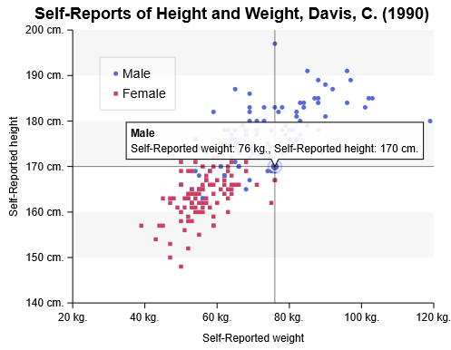
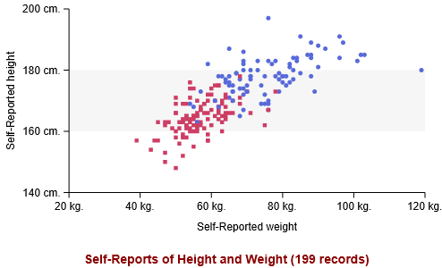
A Mark is a way to represent data, for example, Line, Column, Area... In the previous image, the mark is a PlotMark, a mark used to create a scatter plot.
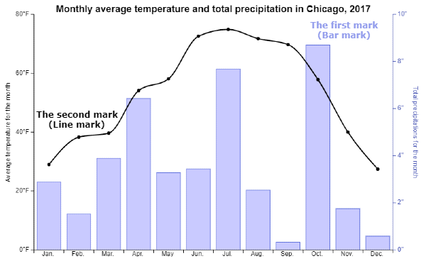
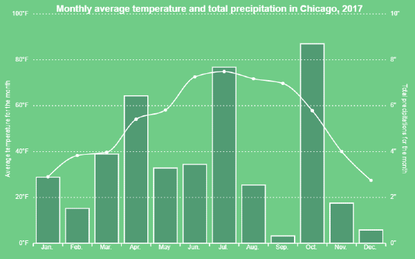
There can be several marks in a Chart like in this image, a BarMark (in blue) and a LineMark (in black):
private fun VizContainer.createChart(data: List<Record>): Chart<Record> =
    chart(data) {
				(...)

				// your first "mark" is a BarMark
				bar(dimension1, dimension2)

				// your second "mark" is a LineMark, note that it share the same X-dimension
				line(dimension1, dimension3)
		}
The marker
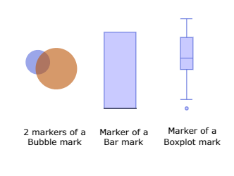
The marker is the visual representation that a Mark draws to display a single element.
In a scatterplot, the marker would be a single "plot", for a bubble chart, each unique bubble would also be called a marker.
Generally speaking, the task of a mark is to draw markers for every record in your dataset.
The axis
The axis is composed of several parts you can customize:
- the title
- the ticks
- the axis line
- the labels
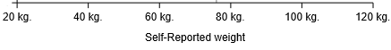
You can also place it at different position (top, left, right...).
You can also choose from the axis to display in the charting zone "gridlines" or "alternate background" to help with reading the chart. They will be placed based on the ticks values from your axis.
Look at this chart, it's the same as the previous one, but with a different theme, not that for the Y-axes:
- axis lines and ticks are disabled
- gridlines are enabled
The title
Once you set a title value to your chart, a title will be displayed at the top position by default.
Don't forget that you're in Kotlin code, so you can display any information you want.
To change your title properties, you can use your own custom configuration, or change it inline, in the config block:
private fun VizContainer.createChart(data: List<Record>): Chart<Record> =
chart(data) {
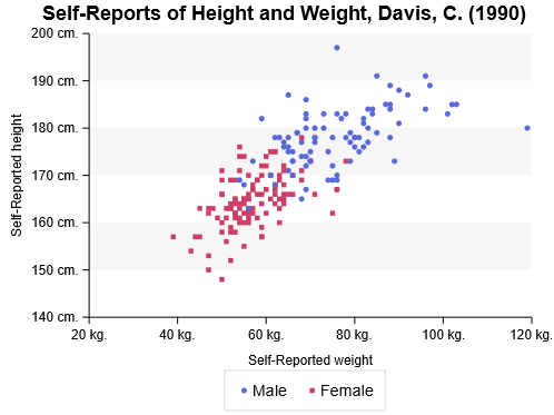
title = "Self-Reports of Height and Weight (${data.size} records)"
config {
title {
layout = LayoutPosition.Bottom
fontColor = Colors.Web.darkred
fontSize = 14.0
}
}
(...)
}
The legend
You can enable a legend in your chart, to display informations about your series.
By default, the legend is placed in the chart where there is enough space to display it, but, in the config DSL, you can force the legend to be displayed "outside" the charting zone at a given position, like here at the bottom of the chart:
private fun VizContainer.createChart(data: List<Record>): Chart<Record> =
	  chart(data) {
				(...)

				config {
						legend {
                show = LegendVisibility.Show
                layout = LegendLayout.Horizontal
                position = LegendPosition.Bottom
            }
				}
		}
The tooltip
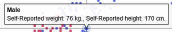
The tooltip is used to display information when highlighting markers.
By default, your tooltip will use available information like dimensions' names and formatters to display itself automatically:
However, it is possible to override every aspect of the tooltip and use it to display your own custom information using custom formatters:
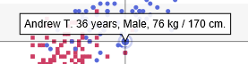
private fun VizContainer.createChart(data: List<Record>): Chart<Record> =
  chart(data) {
		(...)

		tooltip {
			formatter = {
					"${domain.name} ${domain.age} years, ${domain.gender},"
			   +" ${domain.weight} kg. / ${domain.height} cm."
			}
		}
	}
The cursor
The cursor is used to identify a highlighted marker, it enhances the readability of your chart when there is a lot of information on the screen.
A cursor can be horizontal, vertical or both (crosshair), depending on the chart type, the cursor automatically switch to the the best option, but you can change it in the config DSL:
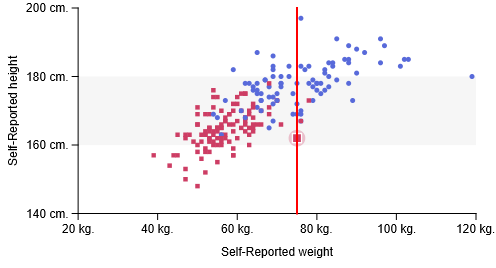
private fun VizContainer.createChart(data: List<Record>): Chart<Record> =
	  chart(data) {
				(...)

				config {
						cursor {
                show = true
                type = CursorType.Vertical
                strokeColor = Colors.Web.red
                strokeWidth = 2.0
            }
				}
		}